[Module #4] CSS (#4-3)
#4-3 . Transformations
Transformations는 html문서의 element들을 변경, 모습이 변하는 효과를 뜻한다.
구조는,
transform: properties(value);
Properties
- backface-visibility
- perspective
- perspective-origin
- rotate
- scale
- transform
- transform-box
- transform-origin
- transform-style
- translate
Data types
The transform-function CSS data type represents a transformation that affects an element's appearance. Transformation functions can rotate, resize, distort, or move an element in 2D or 3D space. It is used in the transform property.
developer.mozilla.org
<!DOCTYPE html>
<html lang="en">
  <head>
    <meta charset="UTF-8" />
    <meta name="viewport" content="width=device-width, initial-scale=1.0" />
    <title>Transformations</title>
    <style>
      .box {
        height: 200px;
        width: 200px;
        background-color: aquamarine;
        transform: rotate(20deg);
      }
    </style>
  </head>
  <body>
    <div class="box"></div>
  </body>
</html>
이러면, 20도 각도로 돌아간 사각형이 보여진다.
https://developer.mozilla.org/en-US/docs/Web/CSS/transform
transform
The transform CSS property lets you rotate, scale, skew, or translate an element. It modifies the coordinate space of the CSS visual formatting model.
developer.mozilla.org
연습할 수 있는 properties.
재밌는건 , 이걸 트랜지션이랑 합쳤을 때! 이다
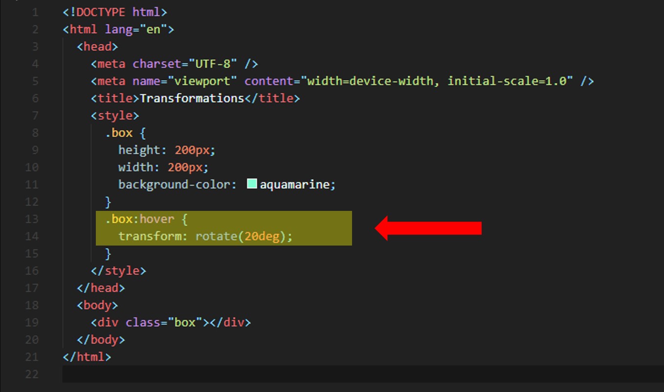
이렇게 추가하면, hover했을때, 네모 박스가 20도 돌아가게 된당!
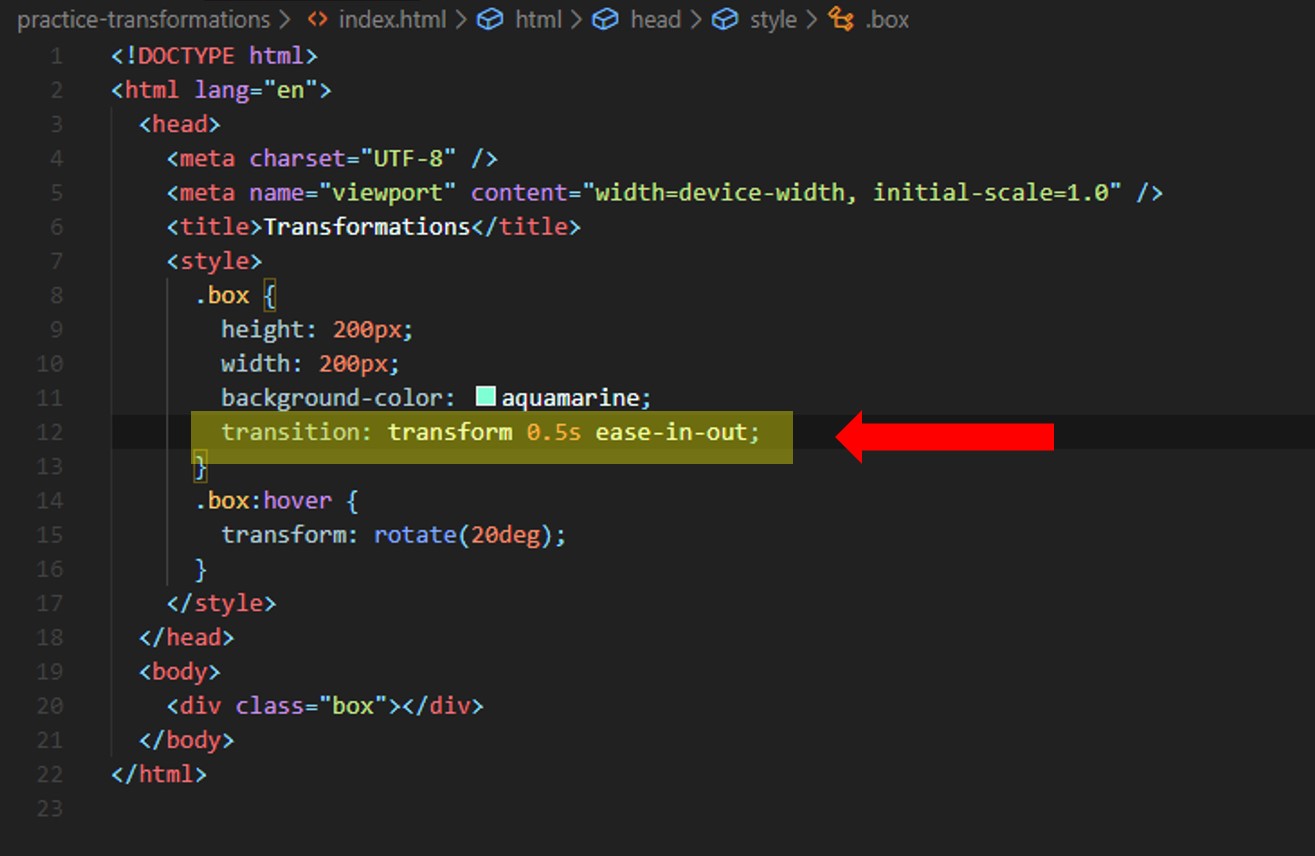
거기에 transition까지 넣어주면!
transition이 들어간 transform이 완성!
**transform: scale(.5, .5) 하면 크기가 반으로 줄어듦!